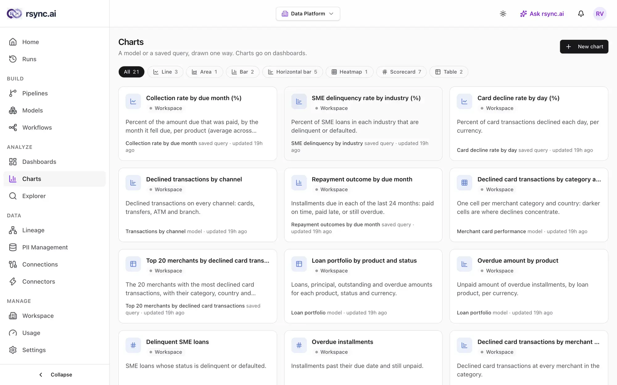
Charts
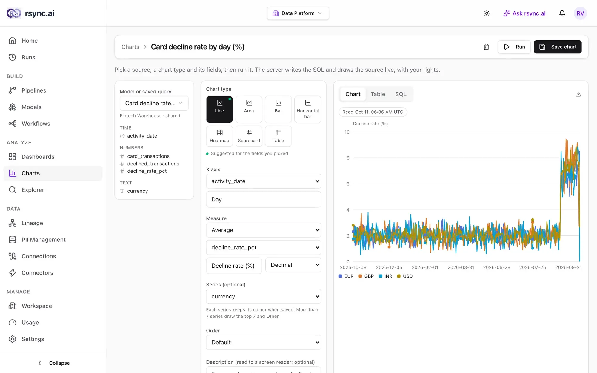
A chart draws one model or saved query, one way. Pick a source, a chart type and a few columns; rsync.ai writes the read-only SQL and draws it.
Make a chart
Open Analyze → Charts → New chart, or select Create chart in the Explorer.
- Source: a model or a saved query. From the Explorer, Create chart uses the saved query you last opened.
- Chart type: bar, horizontal bar, line, area, heatmap, scorecard or table.
- Columns:the x axis, a measure, and optionally a series column that splits the chart into one line or bar per value. Only the source's own columns are offered.
- Run draws it and shows the SQL rsync.ai wrote. Save chart keeps it.
The measure is a count, a count distinct, or a sum, average, minimum or maximum of a column. The grouping runs on your database, so a chart is one read-only statement, and the settings are checked when you save and again every time the chart is drawn.
Chart types
| Type | Good for |
|---|---|
| Line, area | A measure over time, one line per series. |
| Bar, horizontal bar | Comparing categories; horizontal when the labels are long. |
| Heatmap | Two categories at once: darker cells show where a measure concentrates. |
| Scorecard | One headline number. |
| Table | The rows themselves. Export them as CSV. |
A chart draws up to 7 series, each in a fixed colour. When there are more, it draws the 7 largest plus a grey Otherif the measure can be combined (count, sum, min, max). An average or a distinct count can't be combined, so the rest are left out and the chart says how many.
Who sees what
- A chart is Only me or The workspace. A chart can be shared only once its source is shared.
- Every chart reads its rows with the rights of the person looking. A source they can't see isn't drawn, and a column the Explorer masks for them is masked on the chart too.
- Owners and admins make, change and delete charts. Members and viewers open the charts they're shown.
Export and email
Export a chart as PNG or SVG, or a table as CSV. To email a chart on a schedule, add a chart step to a workflow: in email a plotted chart is sent as a picture and a scorecard or table as text; in Slack the numbers are sent as text.
Ready to try it?
Start building on rsync.ai Cloud today — or self-host on your own infrastructure.